Showing posts with label acrylic. Show all posts

Thursday, March 20, 2014

New Etsy Shop and Content

If you like my work and are interested in buying any of them, or simply checking out new pieces I have created, here is my etsy shop that I just got up and running. I appreciate your support, and am working on setting a schedule to more frequently update this blog. I have about 30 new paintings I have done since my move to Seattle, WA and am excited to share them with you. 

https://www.etsy.com/shop/SensoryIntegrity

For now, here is a couple examples of some of my new work. 
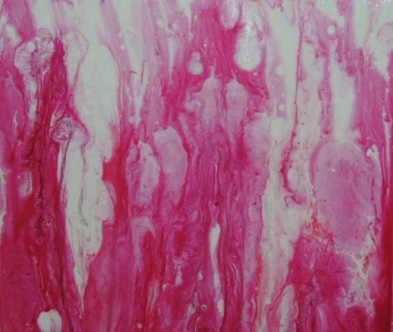
This first piece was created with acrylic inks, both colored and iridescent, which are embedded in a layer of pouring medium. This adds depth and dimension to the piece, and the interference/iridescent inks add complexity as the colors change in different lights. It reminds me of stained slides in a microscope and looks like something from an internal anatomy structure, without being directly referential of any particular structure.  This piece is done on 10in by 10in canvas with painted sides, ready to be put on display. 
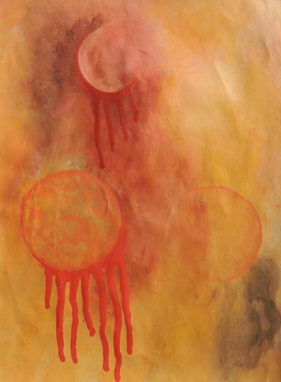


This piece was created solely with the use of acrylic paints, which has become rare for me, since I love so many media and can hardly contain myself to just one. It was done during my phase of planet/galaxy interest, and  has an alien sky feel to it. It was done on 9in by 12in paper and comes sealed in an art protector.

Thursday, January 9, 2014

Persephone Unbound

I have not posted in awhile, being busy with a move across the country and having to abandon 99% of my collection. I am happy to have started fresh and am finally painting on canvas again. This piece was named by someone very important to me, and I am quite proud of how it turned out.

Sunday, March 31, 2013

New artistic painted pillow

This pillow is 14.5 inches by 14.5 inches. I purchased the fabric yesterday after I had painted the circles on my first pillow, which matched in style but not quite in color. I made a new, larger pillow today, by using the same style and matching the colors to the fabric this time. The painted front side is canvas fabric, while the back is fabric made of rayon and polyester.

Saturday, March 30, 2013

Painted canvas pillow, part 2

This is my first completed, handmade canvas fabric pillow. I just finished cutting, painting, stuffing and sewing it, and now I'm ready to test it out with a nap.

Friday, March 29, 2013

Handpainted throw pillow, part 1

I just got a large amount of canvas fabric to start making artistic throw pillows. When this is done, it will be approximately 15 x 15 inches, since I prefer square throw pillows. I want to feature a bunch of different colors, styles and sizes of painted pillows. This one is starting as a minimalistic, more subdued circle print, which will be continued on the back. Some of the pillows will only have one side painted, while others will have both. I want some architectural lined prints and some abstract bright colored ones in the near future.

Tuesday, March 19, 2013

An experiment in color


I was looking though my previously painted pieces, and came to the realization that I rarely use more than 2 colors in each piece. I do use tints and shades of the colors, but had no examples on hand of a painting with more than 3 separate colors. This is what I created while trying to remedy that. I had my tube of alizarin crimson out, which has quickly become one of my favorite colors to work with. I used as many colors as I could in this piece, by mixing some, then using my store bought-premixed version next to the ones I mixed. I used my oil painting bristle brushes to help blend the colors, and really like how this piece turned out.

Tape up that texture


This painting is a study in texture, and how one material can deceive the eye into believing it is another material. I created this texture with masking tape, crumpled and piled on top of itself. I then blended the edge lines by using regular matte gel. I gessoed over this piece a few times, to make sure to seal the tape well. I then mixed this particular range of colors with gray, viridian green, alizarin crimson, titanium white ultramarine and prussian blue. I love how the color turned out, and though I initially planned to continue painting and adding straight glazes of alizarin crimson, I have decided to leave it like this for awhile. The larger picture shows the color in more detail, and the second picture shows the texture a little more clearly.

Sunday, March 17, 2013

Bubble Bubble Boil and Trouble Abstract


This is a painting I just finished today using a new technique I learned very recently. I used a heat gun on the paint as it was drying to get the bubbles and boils as a unique texture. I had tested this technique out with gesso yesterday, and am still working on finishing that painting. This cadmium red paint had been sitting in my acrylic box for over a year, since it was too thick and dry to work with when I bought it. It would not come out of the tube anymore, so I cut off the top and added water until it was a more workable consistency. I then used the heat gun for quite a long time, seeing as how the paint was still thick, it took some time to bubble. The nice thing about taking that much time was that the heat gun added all of the tints and shades I needed. The longer I kept the heat on one spot, the darker it would get, and if it was there long enough, it turned an iridescent gold, which looks great with the red. I used the heat gun in multiple stages of the paint's drying process, the more dry or thin the paint was, the smaller the bubbles and boils. To finish the piece off, I used the black spray webbing and heated that as well to add some dimension. Here are two pictures of the painting, one of the whole piece and a close up to show the texture and unique creepiness of the piece. 

Tuesday, March 12, 2013

Abstract Planet Digital Art


I just finished creating this digital art piece in Photoshop. I stumbled across a few Photoshop tutorials online, since I am so new to the software. This was one of them, showing how to create a space scape. I used a painting that I had created with acrylic paint on paper, and changed the saturation. I then added a lens flare, shadow and glow to the planet to create the look. I am excited to create more pieces like this with Photoshop. I am always excited to learn to create in a new medium, and the more I learn, the more I realize that there is still so much I have yet to try. It is so exciting to have a passion that is practically endless with possibilities. It is overwhelming at times, trying to decide what to create next. I am just thankful to have so many supplies and time to do what I love most, create art.

Monday, March 11, 2013

Abstract ink painting on 11*14 paper


A friend of mine came over today so we could paint and create together. She had some very inspiring ideas, and while she created, I worked on this new paper painting. I started with a thick layer of acrylic paint, which I then removed some of and distressed with a spray bottle and paper towels. I then started splattering different media across the paper. I started with iridescent ink, then added some alcohol ink, acrylic ink and even fluid acrylic paint for some dimension. I let some of the colors mix and intermingle, while others I dried first before adding another layer. Towards the end I started tilting the paper so some of the drips and splatters could run. I then sprayed a spray bottle containing water thinned acrylics to finish off the whole painting. I am excited about this picture because the only editing I had to do to it was to crop it, there was no messing with the saturation needed. This photograph is the exact colors of the actual painting. I am happy to finally have a way to share my work, exactly as it appears in real life.

Friday, March 8, 2013

Alien planet

I painted this abstract painting a couple years, and sold it at one of my first art shows. I was at the owner's house tonight, and got an opportunity to take a better picture of it than the ones I had. I did this painting with a couple layers of acrylic paint, dipping different circles in paint, and using paper towels as a stamp as well. The spikey shaped object was done with oil paint. The whole thing was sealed with varnish after it was dry.

Thursday, March 7, 2013

Finished disgusting beauty

I added some more washes of the primary blue and alizarin crimson, taking out the light and white parts. I am not quite sure if I am going to add the white back in, but for now, I like it how it is. I love how the colors mix and interact together, and bring out the texture.

Wednesday, March 6, 2013

Disgusting beauty

This piece has a certain duality that is quite different from my normal style, yet still piques my creative interest. I started this canvas painting with layers of spackling paste, to obtain the thick texture-ridges and valleys. The spackle was spread with taping knives, which are bigger and sturdier than palette knives, the kind that contractors use on drywall. I then added two layers of gesso to seal the spackle, once it was dry. After that was finished, I added water-thinned washes of acrylic paint, alizarin crimson and primary blue. The strange thing that happened, is that when I added the liquid paints, the gesso started to move and pinch together, in little wrinkles. It added a new creepy dimension to the painting, which stayed this way when dried. This creepy texture fits into my dark, grungy style, while the light, colorful washes contradict that feeling. I love how the beauty and deformity of this painting flow together, similar to how good and bad flow within everyone.

Monday, March 4, 2013

As the color spreads

This canvas board was painted with acrylic paint, and then dipped in and out of water. This thinned the paint and let it run and mix together, creating interesting swirls. I will probably do another layer with the same method, to make the painting more complex.

Saturday, March 2, 2013

Abstract olive green scraper painting

Among my new art supplies, I got some fantastic 5 inch paint scrapers. The work like palette knives in a painting, creating wonderful surface texture, and making even stripes and grids with ease. I have been experimenting with mixing acrylic paints recently, and ready that adding black to cadmium medium yellow creates this wonderful olive green. I wanted to figure out how to use my black paint tube in mixing colors, since I have now found ways to mix richer blacks than what comes in a tube. Mixing colors opens up a whole new world of paint options, and I get such a kick out of learning new techniques and tips for my art. It is so fulfilling to learn a new technique, and be able to successfully conquer it. I have enjoyed making abstract paintings immensely over the last two years, and will continue to do so for a long time. However, I would like to expand my craft and learn some new styles. This is why I have been practicing drawing, and have sought the help of fellow painters who are superb portrait painters. Even if I don't often paint in that style, or enjoy making them too often, I will still like to know how to paint in these different genres. I also want to see what I can bring into my own personal style, maybe twisted portraits of people with an abstract feel. To other artists, do you have your own style or niche you like to create within, or do you enjoy working in a bit of everything?

Tuesday, February 26, 2013

Abstract paper

This 9*12 paper was dipped in the same water bath, suminagashi style, except with water-thinned acrylic paints, as opposed to inks. I didn't like how it turned out, so I flipped the paper over and tried again. As it was drying, I added drops of the paint straight to the paper, along with isopropyl alcohol, removing and adding layers until I was happy. I then tilted the paper, let some of the paint drip and run off, and then placed the paper on an incline to dry.

Monday, February 25, 2013

Abstract experiment

I discovered one of my new favorite color combinations last night, primary yellow and dioxazine purple. It makes a dark, rich black to a dirty yellow color. I did this painting with an idea I got from a local artist. I mixed water thinned batches of these two colors and their combinations, and poured them across the painting. I then colored vegetable oil and poured that across the painting as well. I mixed the two up, until bubbles form, then poured off much of the excess oil and paint. I then set the painting outside in the cold to dry. Once the paint was dry, and the oil just sitting on top, I removed the oil with paper towels. I repeated this process for another layer, then sealed the whole painting with matte finish spray.

Sunday, February 24, 2013

Magenta shade abstract

This piece was done on a 9*12, 98 pound mixed media paper. It was done entirely with different shades of magenta acrylic paint and palette knives. I added paint and then scraped it back off to stain the page in different patterns, leaving some to dry a bit to add geometric shapes. I then used masking tape to add the lines.

Magenta and black abstract

This piece was done on a 9*12 mixed media, 98 pound paper, which is the paper I use for acrylic. I started with a suminagashi layer with water thinned acrylic paints, instead of the acrylic inks I usually use. I did a light layer, but the acrylics can be made as bright as the inks. I then dripped black ink across the page in multiple layers, blotting each with a paper towel, except the last one, this removed some of the ink, while adding a small amount of texture from the paper towel pattern.

Abstract cityscape

This painting was done on 9*12 paper, with acrylic paint. I used only palette knives and two colors, primary yellow and dioxazine purple. I love the dirty, gritty feel of the painting, and the color combination that these two colors create.