Thursday, February 28, 2013

Suminagashi

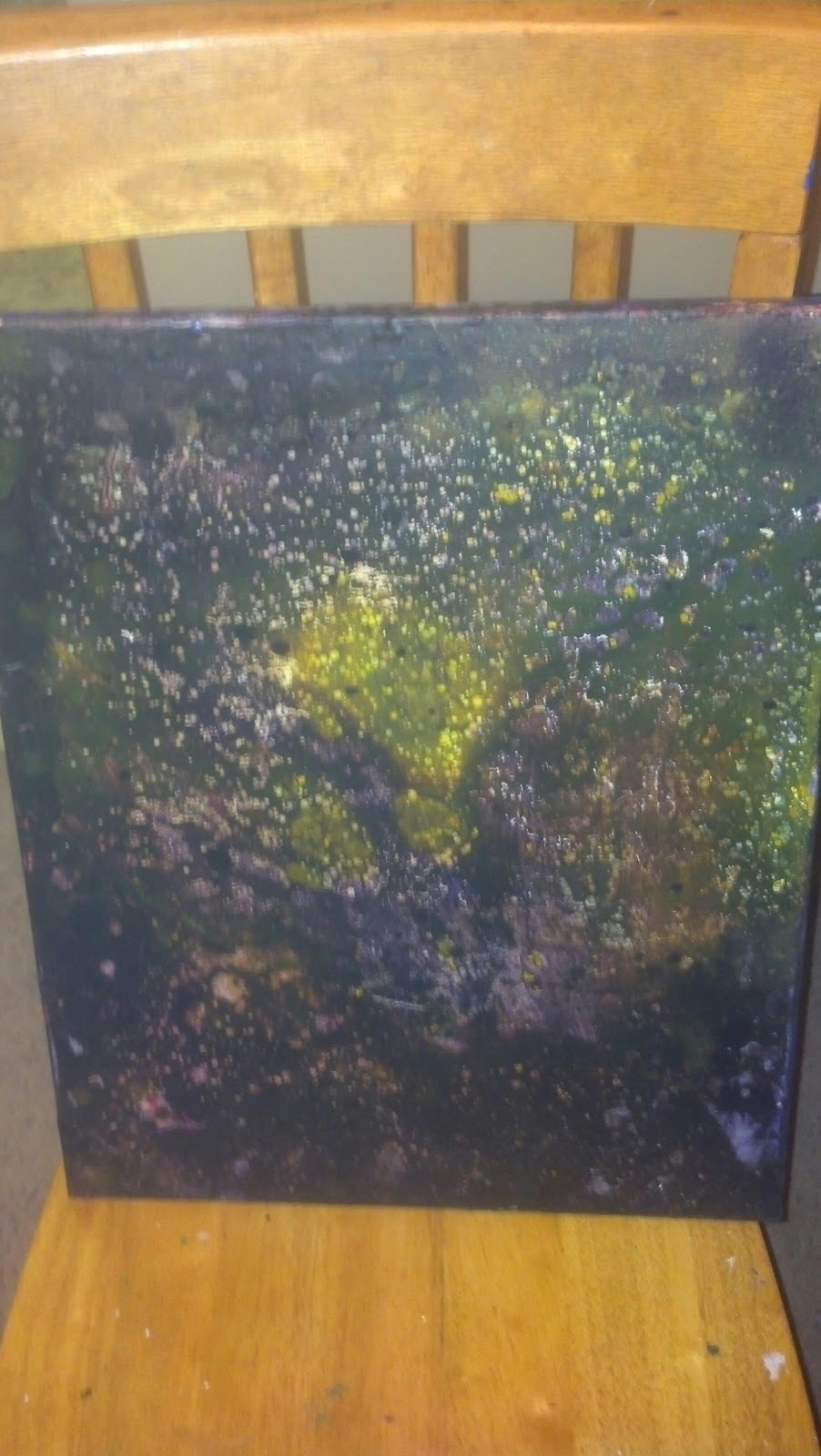
I did some more suminagshi papers with my new art supplies as well. These turned out brighter and more effective, because of the new paper I used. I used newsprint paper, which is made to absorb ink more effectively. I also used some of my new iridescent inks, which add a nice dimension to the prints. I think I am going to attach these pieces to a canvas, and make a full painting from multiple suminagashi prints.

Abstract alcohol inks

I just got a new order of art supplies in the mail, and I am so excited with how the acetate works with the alcohol inks. Here are two examples of different alcohol inks dropped and blown across the clear acetate, which is then attached to white paper, to brighten the inks. I am going to do some new effects with stamps on the paper, behind the colorful ink backgrounds. I am on a 3dimensional kick lately, and want to use actual layers in my new pieces, instead of just paint layers.

Tuesday, February 26, 2013

Abstract paper

This 9*12 paper was dipped in the same water bath, suminagashi style, except with water-thinned acrylic paints, as opposed to inks. I didn't like how it turned out, so I flipped the paper over and tried again. As it was drying, I added drops of the paint straight to the paper, along with isopropyl alcohol, removing and adding layers until I was happy. I then tilted the paper, let some of the paint drip and run off, and then placed the paper on an incline to dry.

Monday, February 25, 2013

Suminagashi charcoal abstract papers

I did some more suminagashi marbled papers, this time adding crushed charcoal to the water before dipping the papers. It added a cool textural element, that looks similar to coffee grounds. I just need to get some spray fixative, so I can adhere the charcoal powder and continue with the pieces. I think I may start offering these papers to collage artists and other artists who use designed papers in their work. I would like to collaborate with multiple artists, to combine the talents of two or more artists in a single piece.

Abstract experiment

I discovered one of my new favorite color combinations last night, primary yellow and dioxazine purple. It makes a dark, rich black to a dirty yellow color. I did this painting with an idea I got from a local artist. I mixed water thinned batches of these two colors and their combinations, and poured them across the painting. I then colored vegetable oil and poured that across the painting as well. I mixed the two up, until bubbles form, then poured off much of the excess oil and paint. I then set the painting outside in the cold to dry. Once the paint was dry, and the oil just sitting on top, I removed the oil with paper towels. I repeated this process for another layer, then sealed the whole painting with matte finish spray.

Sunday, February 24, 2013

Magenta shade abstract

This piece was done on a 9*12, 98 pound mixed media paper. It was done entirely with different shades of magenta acrylic paint and palette knives. I added paint and then scraped it back off to stain the page in different patterns, leaving some to dry a bit to add geometric shapes. I then used masking tape to add the lines.

Magenta and black abstract

This piece was done on a 9*12 mixed media, 98 pound paper, which is the paper I use for acrylic. I started with a suminagashi layer with water thinned acrylic paints, instead of the acrylic inks I usually use. I did a light layer, but the acrylics can be made as bright as the inks. I then dripped black ink across the page in multiple layers, blotting each with a paper towel, except the last one, this removed some of the ink, while adding a small amount of texture from the paper towel pattern.

Abstract cityscape

This painting was done on 9*12 paper, with acrylic paint. I used only palette knives and two colors, primary yellow and dioxazine purple. I love the dirty, gritty feel of the painting, and the color combination that these two colors create.

Suminagashi

More suminagashi marbled papers. What do you think? Should I keep these as is, or should I add something on top and use them as a background?

Saturday, February 23, 2013

More suminagashi papers

I spent a few hours making more suminagashi marbled papers. I had so much fun with it, and it didn't use as much ink as I initially thought it would. If you have any inks and blank papers, give this technique a try, it is a blast. I can't wait to figure out what to put on top of some of these awesome papers. I need a little more practice getting the inks to appear bright and saturated, like some of them turned out. I think the trick is to create the marbling and dip the paper quickly, before the ink starts to sink into the water. 

Scales texture

I made a new texture on this paper by gluing rows of cut paper circles on a paper. I used an oversized hole punch to get perfect paper circles. I painted the scales with teal acrylic paint, then brushed purple glaze on top to bring out the unique texture. I'm not sure what I am going to do with this paper, either to add new colors, or cut it up into a monster shape, using the scales to add to the monster.

Suminagashi paper

This new technique I tried today is fantastic. It is called suminagashi, also known as water marbeling. Ink is dropped onto the surface of a water bath, and then paper is dipped into it to pick up the patterns. It is beautiful and completely abstract. I am working on a bunch tonight and post more soon.

Jar of stars

I made some little star puffs out of paper strips. I got the jar from an awesome vintage shop, along with some fantastic frames. I already filled one jar up with clay eyeballs for my own collection. These stars are considered to be wishing stars, which can be written on the paper before they are folded into the star puffs.

Texture towers

This piece has a lot of different things going on in it. I started with prints, to make the towers, using corrugated cardboard painted with acrylic paint to make the towers. I then smeared them while they were still a little wet. I added texture with acrylic and paper towels, and splattered watercolors all over the piece. The grids are made with painted drywall tape, another great invention I just found out about. My favorite part is the bright warm colors I achieved by using crushed chalk pastels like watercolors, wet and with a paintbrush. I just learned today that this can be done to paint with the pastels, and it looks wonderful. I think these may replace my finicky watercolors altogether.

Sunday, February 17, 2013

Abstract lined watercolors

I am trying to paint often on my mixed media papers, so I can have enough to make a portfolio soon. I was digging though a box today and found some art supplies, including multiple sets of watercolor pans. I colored this piece with one of those sets I found. I added the lines with acrylic paint, by stamping painted corrugated cardboard. I then embellished and added new lines with colored pencils. There is some texture achieved with a couple rectangles of paper that were glued down in the beginning and partially blended in with the watercolors.

Friday, February 15, 2013

Skull stamp painting

This painting was done on a block canvas a friend gave me. I wanted a texture for the underpainting, so I used modeling paste mixed with acrylic paint and acrylic ink. After that dried, I added different glazes with interference powder, ink and paint. I then used different mediums to stamp a skull in multiple places. The stamp I made by carving a potato, which is a fast and affordable way to make temporary stamps. I then added focus by making two of the skulls bleed with acrylic ink and glazing medium.

Thursday, February 14, 2013

Postcards part 2

Here are four more postcards I finished today. They are done entirely with acrylic inks, like the last batch. The top left one I did with sprays, stamps, even using the stamp mounting block as a stamp in the wet ink. The top right one was done with an aged script stamp I stamped and then sprayed water on while it was still wet. The bottom right one was done with drops of ink and water, which ran together in interesting ways. I then stamped the word HARK on it, which almost looks like shark with the way the ink set in front of the H. (This would also fit with the blue background) the bottom right was done with three different inks, all dropped on and blown with straws, to make the spider like tentacles across the postcard.

Abstract ink and acrylic

This abstract piece was done with a layer of acrylic paint first. The texture was achieved with paper towels pressed into the wet paint. I liked how it looked, but it just didn't seem finished. After some contemplation, I added some rings with acrylic ink. They didn't stand out enough, so I filled them in with drops and swirls of more acrylic ink.

Wednesday, February 13, 2013

Postcards

I was digging through my box of paper and came across a pack of blank postcards that I had yet to paint. I thought it would be fun to have something practical and inexpensive to offer at my next art show. I have been having a blast making these, they are small and take way less time than anything else I've done. These are done completely with acrylic ink, water, and stamps.

Batik effect

This piece was done entirely with acrylic inks and water. I first applied a stencil and sprayed the acrylic inks over it. I then wet the entire paper, crumpled and uncrumpled it, then added washes the same inks over it. The washes stuck in the wrinkles, creating a batik effect. I then sprayed the inks over that, darkening the whole piece, and adding a border. I then created my own stamp design with different size number stamps, to add a focus to the piece.

Tuesday, February 12, 2013

Distressed paper

This piece was done with another paper I had previously inked an set aside for later. This was done when I accidentally tipped over my bottle of magenta acrylic ink. I didn't want to waste it, as this is my favorite of those inks, so I dipped a paper into it. On top of that I stamped circles with a candle lid, and rubbed them down to streak them. I also sprayed watered down acrylic ink to stain the paper dioxazine purple. My favorite part of this piece is the tearing I did to distress it, ripping only a layer of the paper away while it was still wet. I then glued the paper shred back in different pieces, and added a black wash to highlight the texture.

Mixed media piece

This piece was done in a very opposite style from my last recent paintings, busy and multiple mediums. The first layer was done when I was removing excess computer ink off of a painting. I sopped it up with this paper, and set it aside for future use. On top of that I wrote with my dowel rod utensil, ink acrylic ink. I then added colored inks in the form of splotches and sprayed patches. After that I used some more inks with stamps, and painting some lines on with the ink too. To finish the piece off, I used oil pastels, and an eye shaped stamp pad directly stamped on the paper.

Space quote painting

I was getting a little tired of canvas, as well as running out, so I decided to start working on paper for awhile. Paper is less expensive, easier to paint, due to its smaller size, and currently more abundant in my apartment. This piece was done with acrylic inks and soft pastels. I have been enjoying creating pieces only using two mediums or less. I whittled a dowel rod to a point in order to be able to write the quote with ink.

Poured painting high gloss

This painting was poured with mixtures of pouring medium and acrylic inks. It used much less material than the acrylic poured painting I did a couple weeks ago. I love the high gloss finish that this piece has, it works well to give it that completed look.

Monday, February 11, 2013

Dripped and poured painting

This is the first multi layered, pouring medium painting. It is the largest work I have done with pouring medium and inks, measuring 16 * 20 inches. The background is swirled and has great movement. The monster was done with different layers, done before any dried, each one moved to add dimension to it. 

Large galaxy painting

I took a bunch of pictures of this painting to try and capture the iridescence. I used similar techniques to the last galaxy painting, with a lot more of each medium. It turned into a swirling black hole in the center of the painting.